EIS was designed as a spectrometer that would have good enough spectral resolution to be able to look at the detail of emission line profiles, and one of these details is the spectral line width.
Spectral lines measured in the solar corona have a finite width - Full Width at Half Maximum, or Gaussian 1/e width (either is fine as long as you're consistent!), and this is attributable to a number of factors. First is the natural width (a direct effect of the uncertainty principle and negligible in practical terms). There's instrumental width (known or inferrable); thermal Doppler width (predictable, due to Doppler shifts caused by Brownian motion, which are significant in the million-degree corona!); and a microturbulent velocity or non-thermal velocity term. These terms add together in quadrature, but it's mainly the last term that's of interest here. If you make the assumption that the other factors are steady (and we'll come back to that at the end), then any variation in line width will be due to variations in the non-thermal velocity.
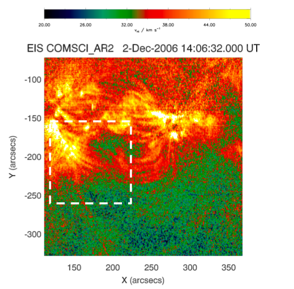
Figure 1: Map of an active region showing the spectral width of the Fe XII 195.12 Å line, corrected in the manner described in Doschek et al. The scale is the equivalent microturbulence velocity, measured in km/s. The dashed white box is shown in more detail in Figure 2.
In the first few months of the Hinode mission, a curious phenomenon was discovered in the solar corona by Doschek et al. (2007). Fitting Gaussian functions to the Fe XII 195.12 Å line measured across an active region, they saw the familiar bright, loops that we're used to seeing in active regions. They also saw these loop-shaped structures in the pattern of line width, too: there were loops of high non-thermal width. You can see this in
Figure 1 where we've reproduced the line width map shown by Doschek et al.
The interesting thing, however, is that the loops which were bright weren't in the same place as the loops that were spectrally broad! When you take a look at
Figure 2, you can see a fiducial white dot with a black outline. Notice that the position of the dot in the left is on a loop-shaped line-width structure. But when you look at the normal (i.e. line intensity) image on the right, the dot falls between loops. This isn't just a freak anti-correlation: it's common all over the active region.
At face value, it seemed counter-intuitive: why would there be so much motion in areas where there is so little emission measure? It's something that's been interesting me for a while. So why should this be?
Doschek et al. actually suggest a number of possible explanations: I'd invite you to read their rather excellent paper on it. Briefly, among these explanations is that perhaps the temperature in these places is above the peak formation temperature normally in calculating the thermal Doppler width. Which would suggest higher ion temperatures in these places than in the loops.
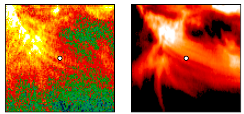
Figure 2: (left) The 195 Å spectral width map inside the dashed box of Figure 1, corrected in the manner described in Doschek et al. Notice that the dot - which is in the exact same place in both images - lies on a loop-like structure on the left (line width image) but between loops on the right (brightness).
Something that's been at the back of my mind for a while is: what if it's just an effect of perspective? Emission in the corona is (by and large) optically thin: photons, once emitted outward along a given line of sight, have a very good chance of making it along that line unless they get intercepted by something much denser (like a telescope). So photons emitted from plasma behind a loop don't get blocked: they add to the loop's brightness (see multiple papers on coronal background subtraction that we definitely won't go into here). The same goes for the foreground: there is still corona in front of loops which can contribute to emission. Active regions loops, almost by definition, are brighter than anything else around them, so the shape of the line emission from them will tend to dominate the total line emission seen there. In the Fe XII line in which the effect was first noticed, the contrast ratio with the surrounding "fuzz" of the corona is a factor of something like 2 to 4. So one question is: are large line widths seen beside active region loops, or glimpsed in between them?
One approach is to try and remove at least what lies
below loops, by going to the solar limb. In a paper presented at the Hinode 3 meeting in Hitotsubashi, Tokyo last December, we investigated some loops that crossed the solar limb in Dec 2007, hoping to see some change in the line width between loops as we crossed the limb, which would have suggested that the plasma beneath loops was due to disc emission.
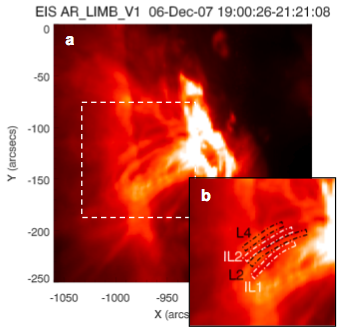
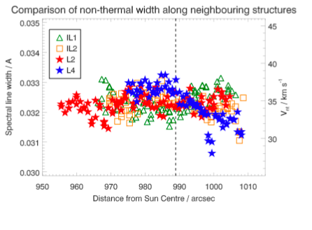
Figure 3: (left) some of the better defined loops that cross the limb are outlined in dashed lines, along with regions beside them; (right) a plot of the non-thermal width in (and between) the loop structures, as you cross the limb (dashed line).
What we saw, though was something else: a pretty clear fall-off of the non-thermal width as soon as we crossed the limb in one of the loops, but no such trend between the loops, or in another of the loops. So what's going on?
Whatever the truth, we're expanding the study at the moment, but it's one of those puzzles that EIS is really well tuned-up to tackle.
References:
Doschek et al. (2007), ApJ, 667, L109